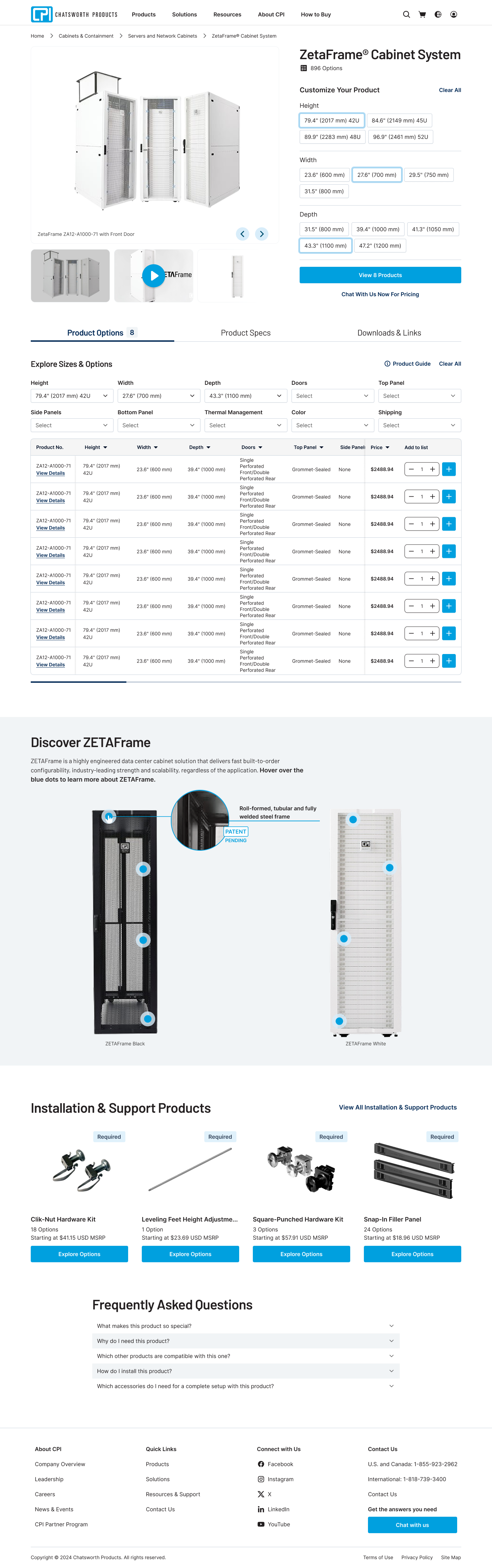
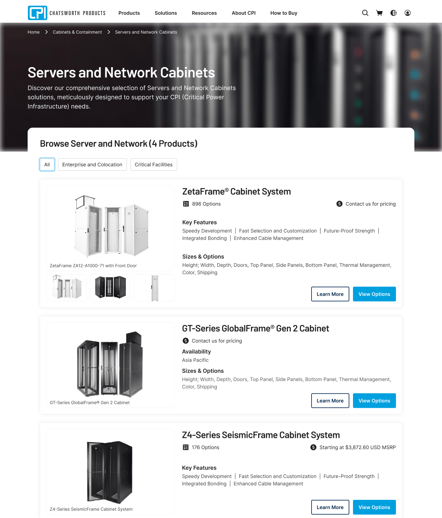
Starting with the Series Page and product table, I redesigned the experience to support progressive decision-making instead of immediate, overwhelming comparison.
Key design decisions on the Series Page:
- Shifted from “show everything” to guided selection by using above-the-fold space to help users make a few key choices first and pre-filter the product table.
- Reframed the table as a result of decisions, reducing visible rows and cognitive load before users engage with detailed specifications.
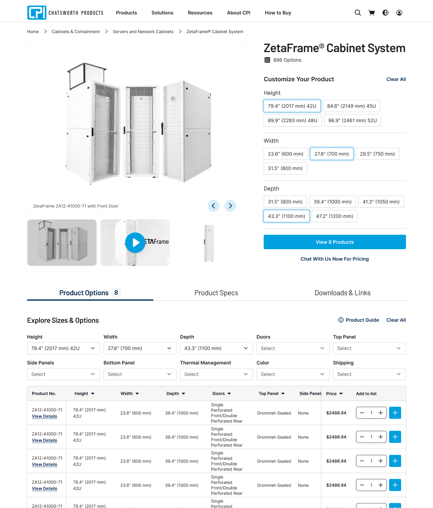
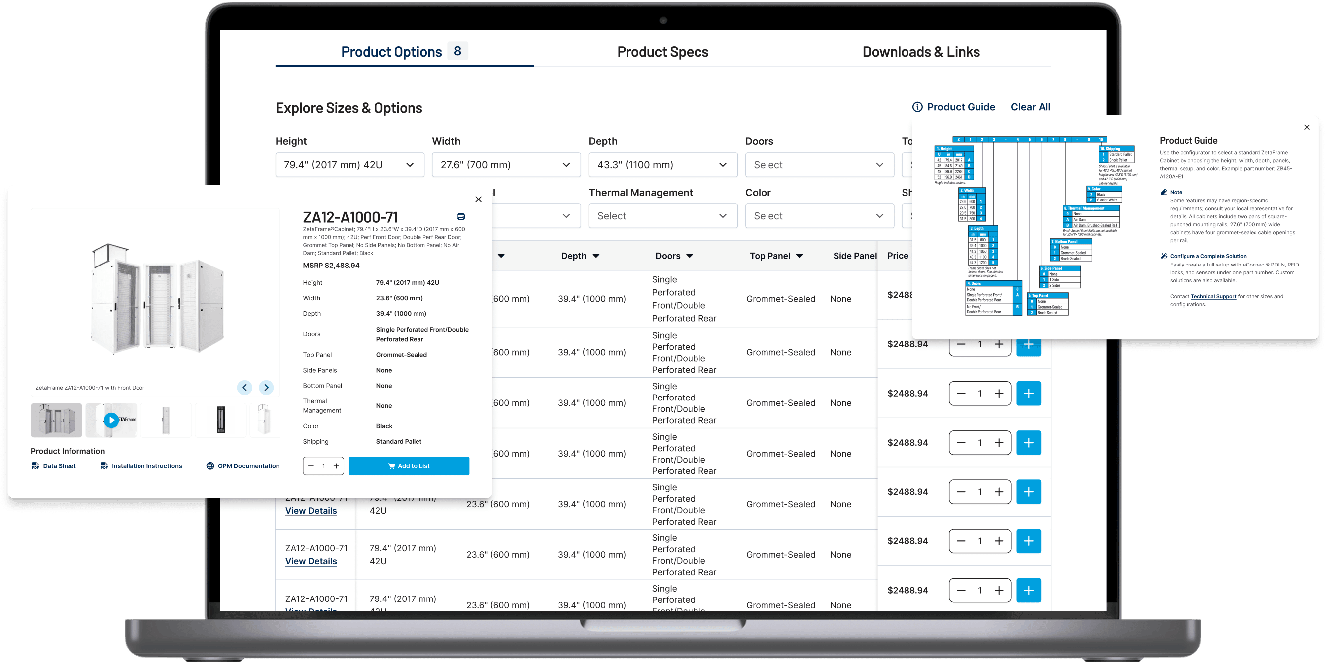
- Added in-context education (Product Guide, interactive product exploration, required accessories, FAQs), allowing users to understand products while evaluating options.
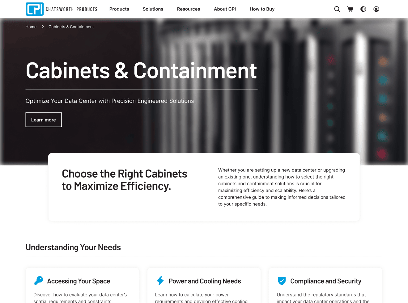
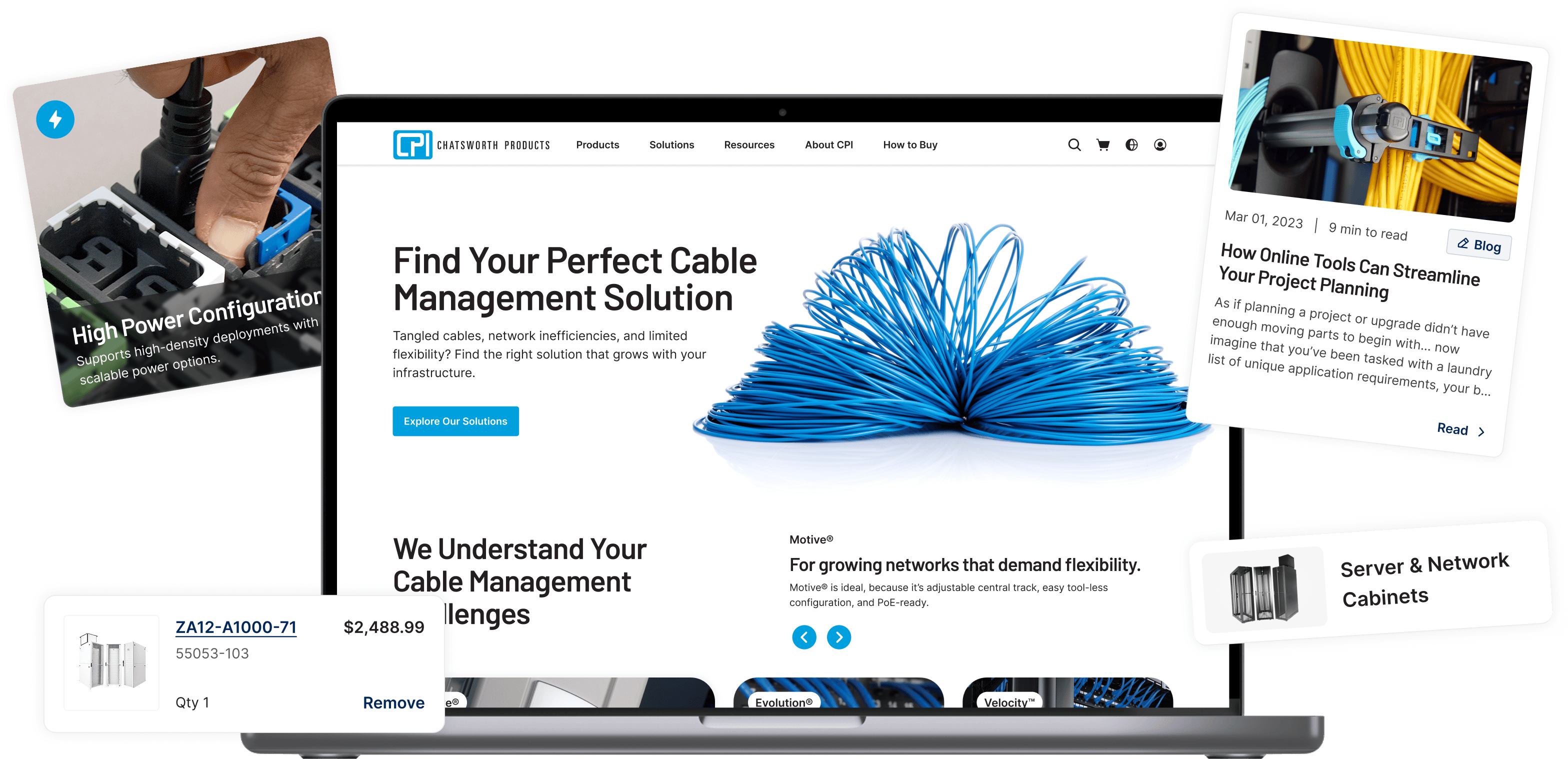
As the redesign progressed, this education-first approach was applied across adjacent pages to ensure clarity and guidance carried consistently throughout the product discovery journey.