Designing a Clear & Accessible Resource Discovery Experience
Making community resource mapping easier to explore, contribute to, and scale.
Discoverability of resources through clearer navigation

.png)
Confidence and ease when adding new resources

Making community resource mapping easier to explore, contribute to, and scale.
Discoverability of resources through clearer navigation
Confidence and ease when adding new resources
Role:
User Research, IA, UX & UI Design
Timeline:
2021-2022
Team:
PM, Designer, Devs
PHLASK is an open-source platform developed with Code For Philly to help people find publicly accessible free resources, such as water, food, bathrooms, and foraging locations across Philadelphia. I joined as a volunteer UX/UI designer in 2021, partnering with cross-functional volunteers and contributors.
The core challenge was to expand the platform to support new resource types (beyond water and food) while maintaining clarity and usability.
Early work uncovered deeper issues:
These issues limited the platform’s ability to grow its user base and support community participation.
Redesign PHLASK to support:
Discovery
Information Architecture
Visual Design
Development
I approached the redesign by addressing both structural clarity and information discovery — starting with navigation and scaling outward into usability and consistency.
Key design decisions:
As the redesign progressed, usability insights informed feature refinements, onboarding improvements, and interaction clarity improvements across both mobile and desktop.
.jpg)
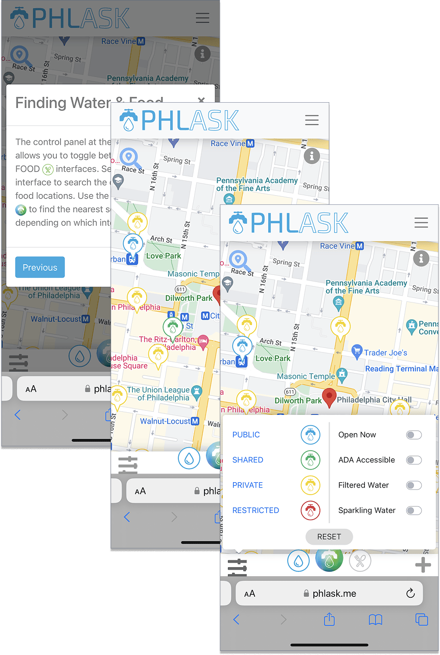
Below are selected screens from the redesigned app.
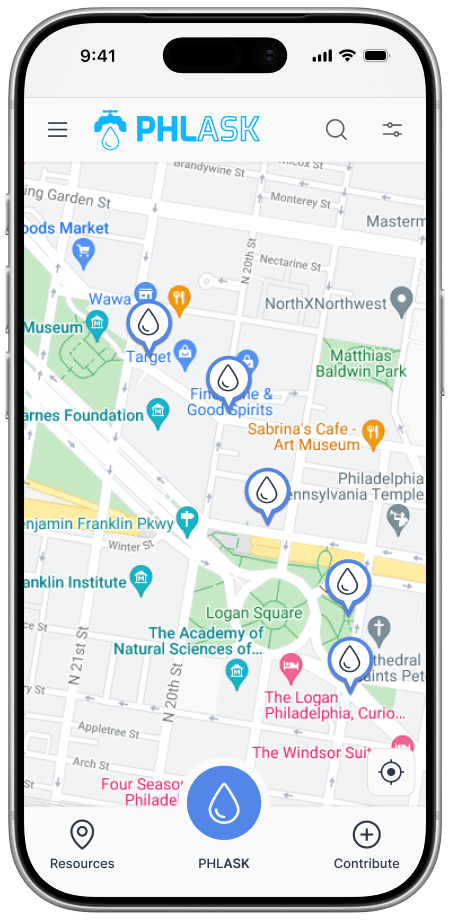
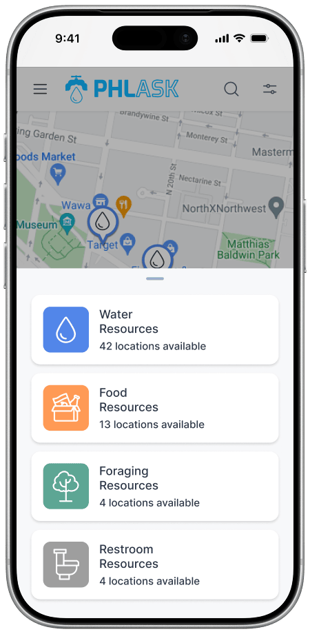
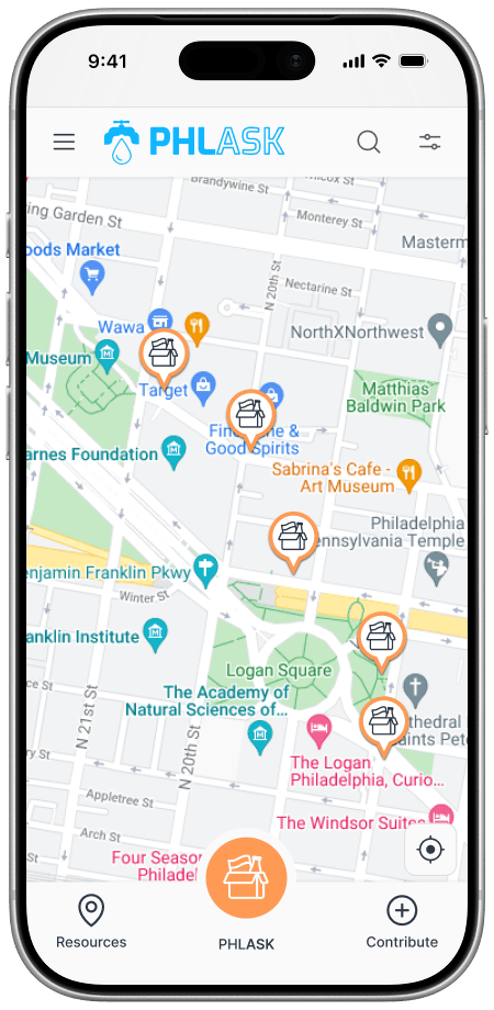
Unified resource menu and interactive map: Allows users to switch between resource types (water, food, foraging, restrooms) while keeping spatial context and clear visual feedback.
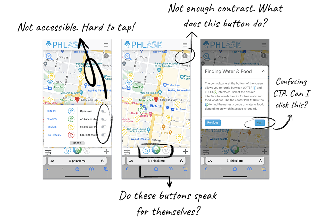
Initial UX audit: Identified accessibility issues, unclear affordances, low contrast, and interactions that required prior knowledge to understand or use.
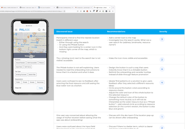
Post-redesign usability testing: Confirmed improved clarity around core actions such as finding the nearest resource, switching resource types, and understanding map controls.
.png)
A simplified, accessible journey that makes discovering and contributing resources easier for everyone through clearer onboarding, intuitive navigation, and inclusive design.
Discoverability of resources through clearer navigation
Friction in core tasks like finding and filtering resources
Confidence and ease when adding new resources
Scalability through a coherent style guide
Deeper exploration of relevant product series
Redesign effort for future resource expansions

What I’ve Learned
Iterate with intention.
By validating ideas through usability testing, I was able to focus iteration on the moments that mattered most to users.