Bringing clarity to a complex digital experience
Creating an accessible, expressive, and modular website for the Writers Guild of America West.
- Clearer navigation across content-heavy pages
- Reusable components and editorial flexibility
- Accessibility from typography to focus states
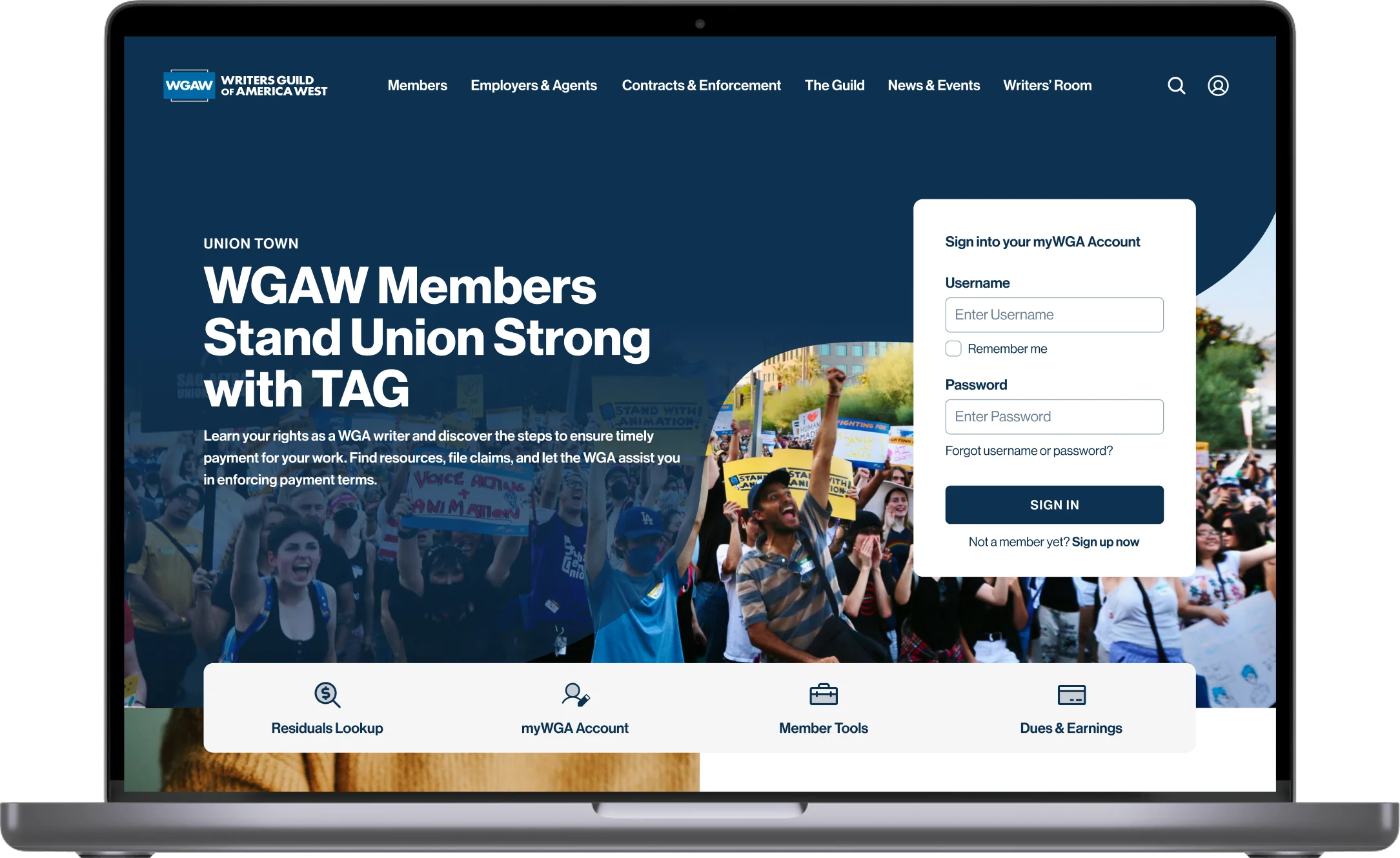
Modernizing WGA West’s digital presence
The Writers Guild of America West represents thousands of writers in film, television, and digital media. Its website is an important resource for members, industry professionals, and the public, bringing together extensive information, services, and organizational updates.
The project involved a complete UX and visual redesign of WGA.org, while retaining the organization’s existing CMS.
- RoleUX/UI Design
- ClientWGA West
- Year2025
Making a content-heavy website easier to navigate and maintain
WGA.org served a wide range of audiences and contained an extensive amount of information. The existing pages lacked consistent visual hierarchy, making lengthy content difficult to scan and navigate.
At the same time, WGA’s content team needed greater flexibility to create and update pages without relying on custom layouts for every new content need.
The challenge was to improve both experiences: helping visitors find and understand information while making the website easier for internal teams to maintain.
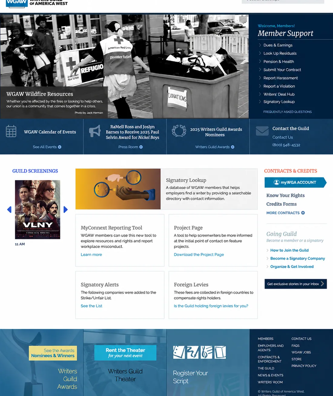
Before: A dense, fragmented homepage.
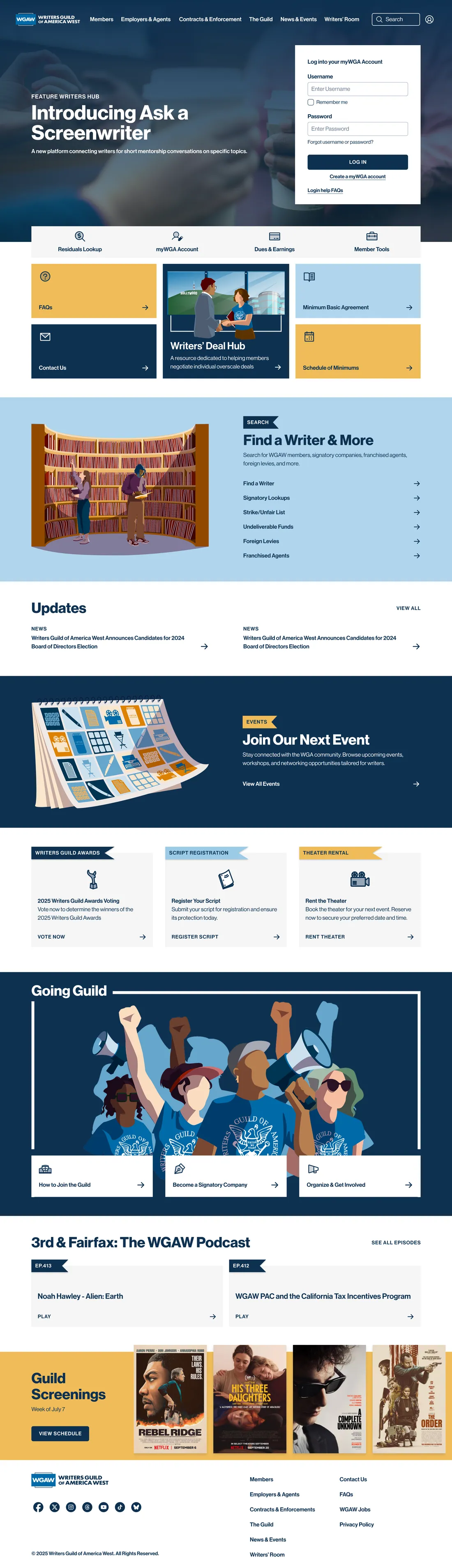
After: A more expressive and structured experience with clearer content hierarchy and reusable visual patterns.
Create clarity for visitors and flexibility for editors
Establish a consistent, accessible experience that makes extensive information easier to navigate, while creating a flexible design system that supports different content types and evolves with the organization.
Bringing structure and personality together
Rather than designing individual pages in isolation, I focused on creating a cohesive system of page layouts, visual patterns, and reusable components.
The redesign balanced WGA’s expressive personality with the clarity needed for a content-heavy website.
Making long-form content easier to navigate
We kept the main navigation largely familiar, but introduced a more consistent structure for interior pages.
The key decision was to organize each page into two distinct areas: a sidebar for section navigation and a dedicated content column occupying approximately two-thirds of the available width.
This naturally constrained line lengths for better readability while allowing visitors to quickly scan the page and jump directly to sections that interested them.
Clearer calls to action and quick navigation links provided additional guidance, helping visitors understand where to go next.
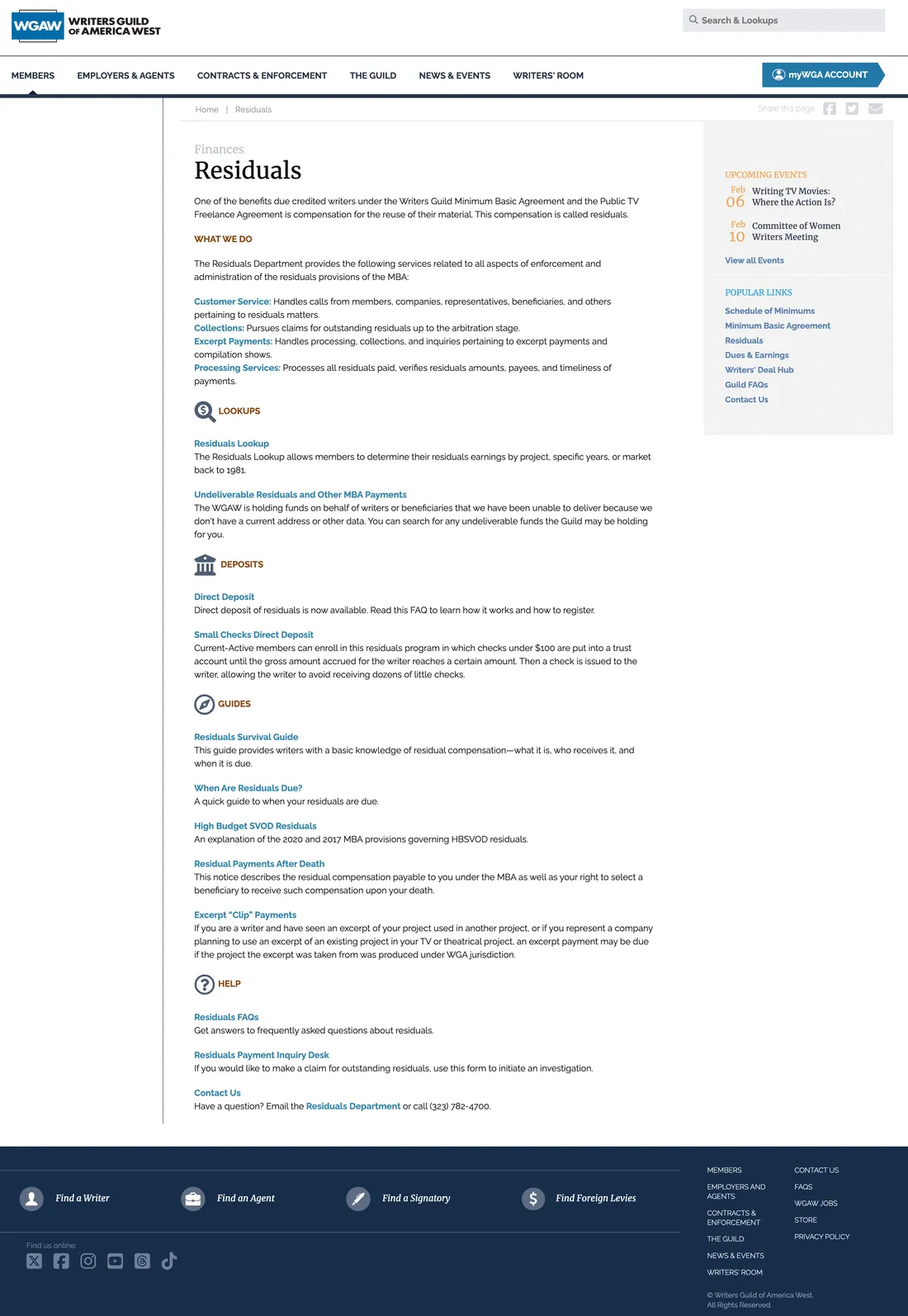
Before: Long-form content with limited in-page navigation and related links separated into a right-hand sidebar.
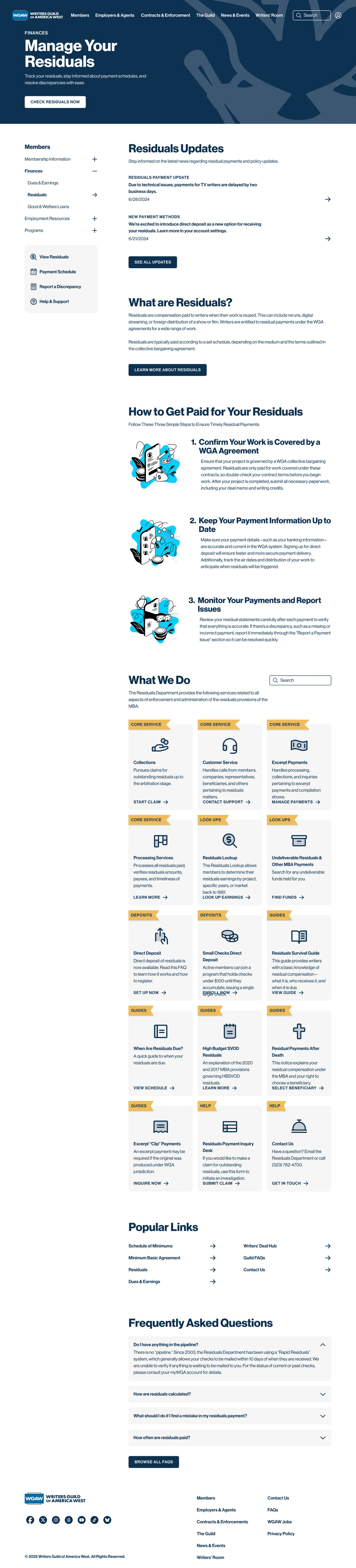
After: A consistent left navigation, constrained content width, clear content groupings, and more visible actions help visitors scan and navigate the page.
Creating an expressive visual identity
Early in the project, WGA shared visual references that reflected their preferences for color, flowing forms, and varied geometric shapes.
I translated those references into a distinctive visual language, combining modern typography, custom illustrations, and colorful graphic elements.
Color-coded hero sections provided an additional layer of orientation, helping visitors recognize which area of the website they were exploring.
The result was a design that felt expressive and creative while maintaining clear hierarchy and readability.
Designing with accessibility in mind
Accessibility informed the redesign throughout, from typography and color contrast to navigation patterns, focus states, and content structure.
Responsive layouts adapted the experience across desktop, tablet, and mobile devices, keeping information readable and navigation usable at different screen sizes.
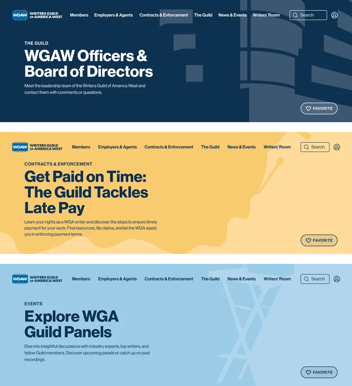
Color-coded hero treatments create recognizable visual cues across different WGA sections while maintaining a shared design language.
Evolving the visual direction through collaboration
When I joined the project, another designer at Thinklogic had already created an initial homepage direction. Rather than starting over, I built on that foundation, refining the visual hierarchy and exploring a stronger visual rhythm, more varied layouts, and a greater emphasis on photography, while keeping the established navigation and overall structure.
As the project progressed, WGA brought a new illustrator into the process and wanted custom illustrations in place of photography. I adapted the design to that direction, balancing the new artwork with the existing component system and maintaining consistency across the experience.
The process reinforced the importance of staying flexible. Having a strong design point of view matters, but so does recognizing that the best outcome is shaped through collaboration, not personal preference.
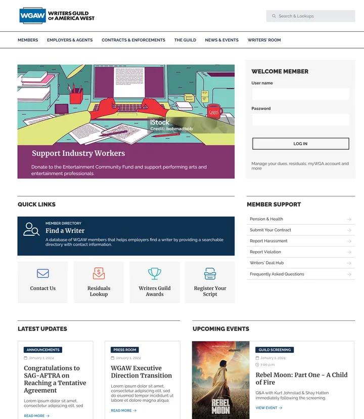
Initial homepage direction inherited from another designer.
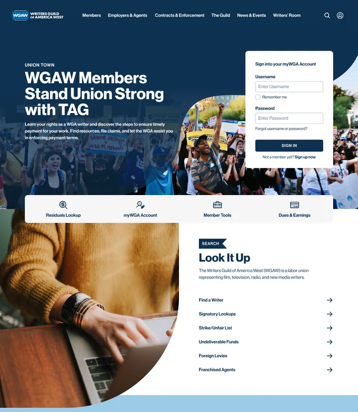
Refined exploration with stronger visual rhythm, varied layouts, and photography.
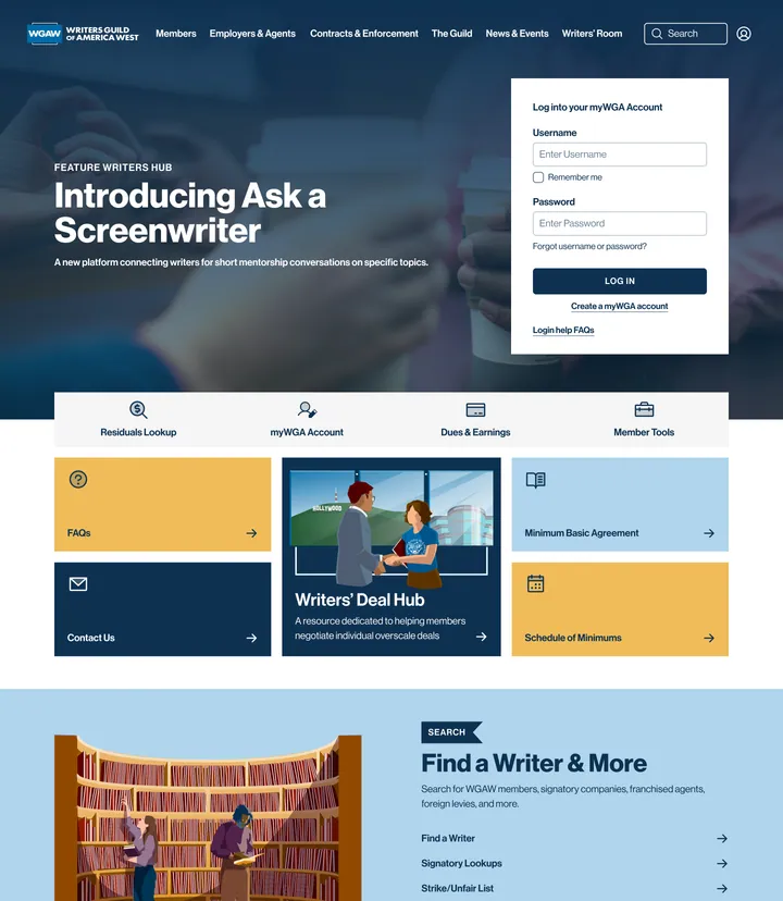
Updated direction incorporating the client’s preference for custom illustrations.
One design language, many experiences
The redesign demonstrates how a shared structure can support different content needs without making every page look the same.
Interior pages follow a consistent two-column layout, combining section navigation with a readable content area. Within that structure, different hero colors, content blocks, illustrations, and page compositions give each section its own identity.
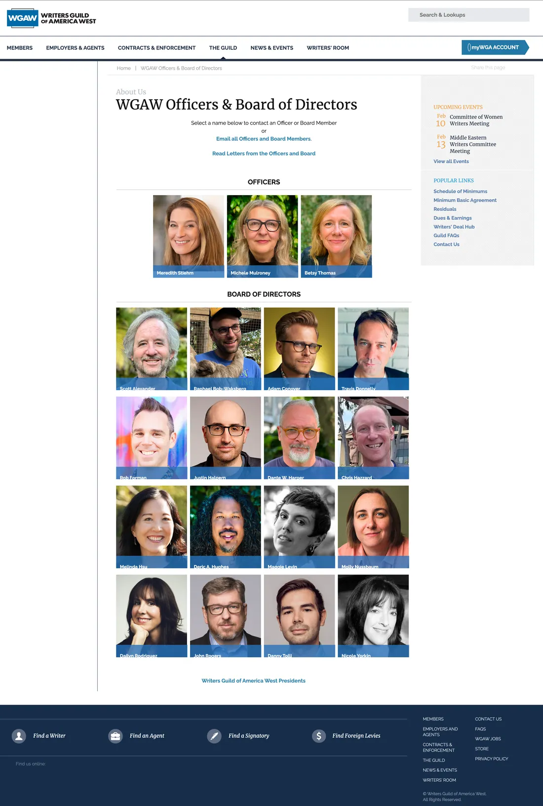
Before: A traditional directory layout with limited visual distinction between content elements.
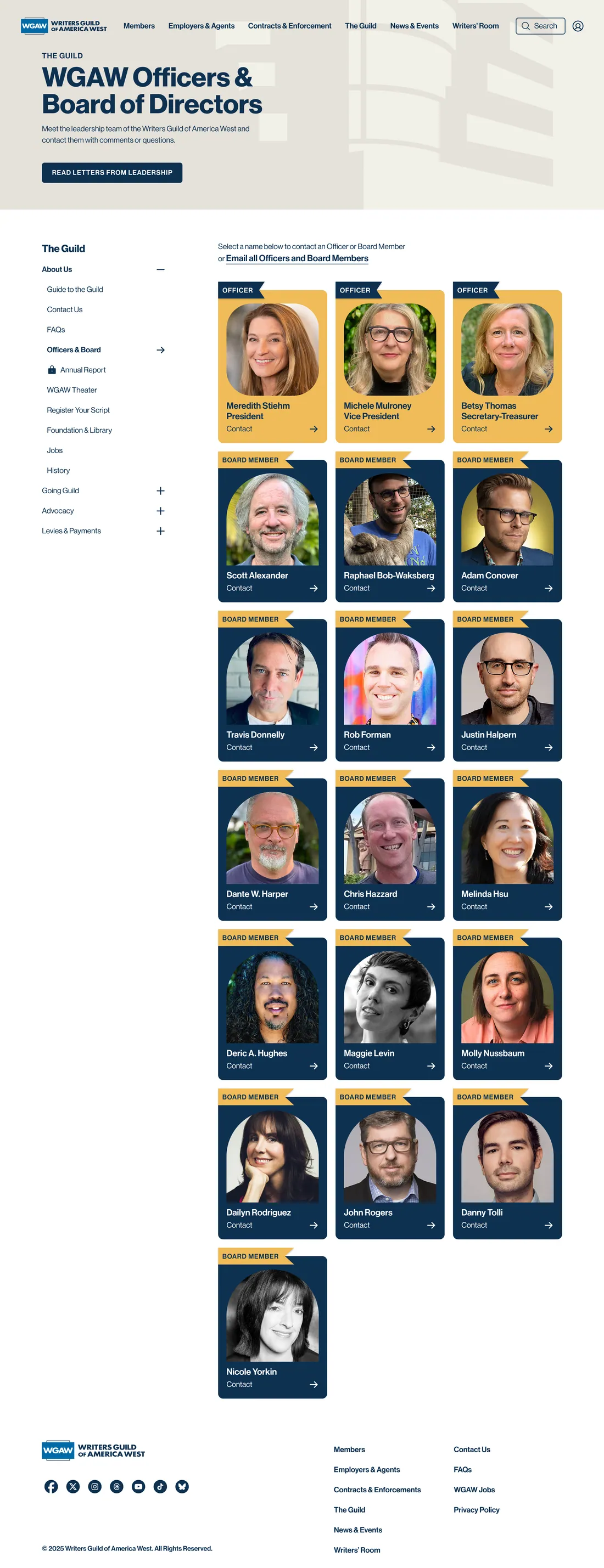
After: A consistent page structure with clearer profile cards, improved visual hierarchy, and direct contact actions.
Together, these examples demonstrate how the system balances consistency for visitors with flexibility for content creators.
Designing for the CMS, not just the page
A significant part of the project was ensuring that the redesigned website could continue evolving after launch.
Rather than introducing a new CMS, we retained WGA’s existing platform and designed reusable components and modular content blocks around its capabilities.
Instead of creating fixed layouts for every page, I designed flexible building blocks that could be combined in different ways.
This gave WGA’s content editors greater independence to create, update, and maintain pages while preserving visual consistency and accessibility patterns.
The design system also established a foundation for related WGA experiences, including mywga.org, WGA Platform, and internal intranet work.
A more accessible and flexible digital foundation
Where it landed
The redesigned WGA.org launched with a refreshed visual identity, clearer content structures, and a reusable component system.
For visitors, the redesign created a more consistent and readable experience, with improved orientation and easier access to information across content-heavy pages.
For WGA’s internal team, modular components provided greater flexibility and autonomy to manage and expand the website within their existing CMS.
A successful redesign isn’t just about the pages people see.
It’s also about building a system that continues to work for the people maintaining it.